It's a must, although it doesn't. Interior design assists you for all time in every single life. Even though It comes away out of your mindful. Sometimes as an ash. Let we share by these medium. Not only interior design, but all designs matter that was shading us. Design is when you opening your eyes. Design is way your life.

First of all things, sketching your ideas and philosophy inlined. Hope these blog capable to become a designer pattern.

Let the design shows the style and versatility personality of you...

MY KUBISM FAMILY

⊆ 10:54 AM by Lineone Indonesia | . | ˜ 0 comments »

My Uncle................ My lovely wife........ My lovely son.... My cousin....


LOGOS EVOLUTION

⊆ 1:19 PM by Lineone Indonesia | . | ˜ 0 comments »

Adobe Systems

Source: Adobe Press

In 1982, forty-something programmers John Warnock and Charles Geschke quit their work at Xerox to start a software company. They named it Adobe, after a creek that ran behind Warnock’s home. Their first focus was to create PostScript, a programming language used in desktop publishing.

When Adobe was young, Warnock and Geschke did everything they could to save money. They asked family and friends to help out: Geschke’s 80-year-old father stained lumber for shelving, and Warnock’s wife Marva designed Adobe’s first logo.

Apple Inc.

In 1976, Steve Wozniak and Steve Jobs ("the two Steves") designed and built a homemade computer, the Apple I. Because Wozniak was working for Hewlett Packard at the time, they offered it to HP first, but they were turned down. The two Steves had to sell some of their prized posessions (Wozniak sold his beloved programmable HP calculator and Jobs sold his old Volkswagen bus) to finance the making of the Apple I motherboards.

Later that year, Wozniak created the next generation machine: Apple ][ prototype. They offered it to Commodore, and got turned down again. But things soon started to look up for Apple, and the company began to gain customers with its computers.

The first Apple logo was a complex picture of Isaac Newton sitting under an apple tree. The logo was inscribed: "Newton … A Mind Forever Voyaging Through Strange Seas of Thought … Alone." It was designed by Ronald Wayne, who along with Wozniak and Jobs, actually founded Apple Computer. In 1976, after only working for two weeks at Apple, Wayne relinquished his stock (10% of the company) for a one-time payment of $800 because he thought Apple was too risky! (Had he kept it, Wayne’s stock would be worth billions!)

Jobs thought that the overly complex logo had something to do with the slow sales of the Apple I, so he commissioned Rob Janoff of the Regis McKenna Agency to design a new one. Janoff came up with the iconic rainbow-striped Apple logo used from 1976 to 1999.

Rumor has it that the bite on the Apple logo was a nod to Alan Turing, the father of modern computer science who committed suicide by eating a cyanide-laced apple. Janoff, however, said in an interview that though he was mindful of the "byte/bite" pun (Apple’s slogan back then: "Byte into an Apple"), he designed the logo as such to "prevent the apple from looking like a cherry tomato." (Source)

In 1998, supposedly at the insistence of Jobs, who had just returned to the company, Apple replaced the rainbow logo ("the most expensive bloody logo ever designed" said Apple President Mike Scott) with a modern-looking, monochrome logo.

Canon

Source: Canon Origin and Evolution of the Logo

In 1930, Goro Yoshida and his brother-in-law Saburo Uchida created Precision Optical Instruments Laboratory in Japan. Four years later, they created their first camera, called the Kwanon. It was named after the Kwanon, Buddhist Bodhisattva of Mercy. The logo included an image of Kwanon with 1,000 arms and flames.

Coolness of logo notwithstanding, the company registered the differently spelled word "Canon" as a trademark because it sounded similar to Kwanon while implying precision, a characteristic the company would like to be known and associated with.

Google

In 1996, Stanford University computer science graduate students Larry Page and Sergey Brin built a search engine that would later become Google. That search engine was called BackRub, named for its ability to analyze "back links" to determine relevance of a particular website. Later, the two renamed their search engine Google, a play on the word Googol (meaning 1 followed by 100 zeros).

Google.com in 1998

Two years later, Larry and Sergey went to Internet portals (who dominated the web back then) but couldn’t get anyone interested in their technology. In 1998, they started Google, Inc. in a friend’s garage, and the rest is history.

Google’s first logo was created by Sergey Brin, after he taught himself to use the free graphic software GIMP. Later, an exclamation mark mimicking the Yahoo! logo was added. In 1999, Stanford’s Consultant Art Professor Ruth Kedar designed the Google logo that the company uses today.

The very first Google Doodle: Burning Man Festival 1998

To mark holidays, birthdays of famous people and major events, Google uses specially drawn logos known as the Google Doodles. The very first Google Doodle was a reference to the Burning Man Festival in 1999. Larry and Sergey put a little stick figure on the home page to let people know why no one was in the office in case the website crashed! Now, Google Doodles are regularly drawn by Dennis Hwang.

IBM

Source: IBM Archives

In 1911, the International Time Recording Company (ITR, est. 1888) and the Computing Scale Company (CSC, est. 1891) merged to form the Computing-Tabulating-Recording Company (CTR, see where IBM gets its penchant for three letter acronym?). In 1924, the company adopted the name International Business Machines Corporation and a new modern-looking logo. It made employee time-keeping systems, weighing scales, meat slicers, and punched-card tabulators.

In the late 1940s, IBM began a difficult transition of punched-card tabulating to computers, led by its CEO Thomas J. Watson. To signify this radical change, in 1947, IBM changed its logo for the first time in over two decades: a simple typeface logo.

In 1956, with the leadership of the company being passed down to Watson’s son, Paul Rand changed IBM’s logo to have "a more solid, grounded and balanced appearance" and at the same time he made the change subtle enough to communicate that there’s continuity in the passing of the baton of leadership from father to son.

IBM logo’s last big change - which wasn’t all that big - was in 1972, when Paul Rand replaced the solid letters with horizontal stripes to suggest "speed and dynamism."

LG Electronics

LG began its life as two companies: Lucky (or Lak Hui) Chemical Industrial (est. 1947), which made cosmetics and GoldStar (est. 1958), a radio manufacturing plant. Lucky Chemical became famous in Korea for creating the Lucky Cream, with a container bearing the image of the Hollywood starlet Deanna Durbin. GoldStar evolved from manufacturing only radios to making all sorts of electronics and household appliances.

In 1995, Lucky Goldstar changed its name to LG Electronics (yes, a backronym apparently not). Actually, LG is a chaebol (a South Korean conglomerate), so there’s a whole range of LG companies that also changed their names, such as LG Chemicals, LT Telecom, and even a baseball team called the LG Twins. These companies all adopted the "Life is Good" tagline you often see alongside its logo.

Interestingly, LG denies that their name now stands for Lucky Goldstar… or any other words. They’re just "LG."

Microsoft

Microsoft’s "groovy logo" source: Coding Horror

In 1975, Paul Allen (who then was working at Honeywell) and his friend Bill Gates (then a sophomore at Harvard University) saw a new Altair 8800 of Micro Instrumentation and Telemetry Systems or MITS. It was the first mini personal computer available commercially.

Allen and Gates decided to port the computer language BASIC for the computer (they did this in 24 hours!), making it the first computer language written for a personal computer. They approached MITS and ended up licensing BASIC to the company. Shortly afterwards, Allen and Gates named their partnership "Micro-soft" (within the year, they dropped the hyphen). In 1977, Microsoft became an official company with Allen and Gates first sharing the title general partners.

On to the logo history:

In 1982, Microsoft announced a new logo, complete with the distinctive "O" that employees dubbed the "Blibbet." When the logo was changed in 1987, Microsoft employee Larry Osterman launched a "Save the Blibbet" campaign but to no avail. Supposedly, way back when, Microsoft cafeteria served "Blibbet Burger," a double cheeseburger with bacon.

In 1987, Scott Baker designed the current, so-called "Pac-Man Logo" for Microsoft. The new logo has a slash on the ‘O’ that made it look like Pac-Man, hence the name. In 1994 Microsoft introduced a new tagline Where do you want to go today?, as part of a $100 million advertising campaign. Needless to say, it was widely mocked.

In 1996, perhaps tired of being the butt of jokes like "what kind of error messages would you like today?", Microsoft dropped the slogan. Later, it tried on new taglines like "Making It Easier", "Start Something", "People Ready" and "Open Up Your Digital Life" before settling on the current "Your potential. Our passion."

Oh, one more thing: what was Microsoft’s original slogan? It was "Microsoft: What’s a microprocessor without it?"

… Microsoft’s very first advertising campaign "Microsoft: What’s a microprocessor without it?," which touted how Microsoft’s line of programming languages could be used to create software that would take advantage of the early microprocessors. The first advertisement in the campaign appeared in a 1976 issue of a microchip journal called Digital Design and featured a four panel black-and-white cartoon titled "The Legend of Micro-Kid." The cartoon depicted a small microchip character as a boxer who possessed speed and power but quickly tired out because he had no real training. The other character, a trainer complete with a derby on his head and big stogie hanging out of his mouth, related the story of how the Micro-Kid had a great future but needed a manager, such as himself, in order to succeed. (source: PC Today)

Motorola

Motorola, then Galvin Manufacturing Corporation, was started in 1928 by Paul Galvin. In the 1930s, Galvin started manufacturing car radios, so he created the name ‘Motorola’ which was simply the combination of the word ‘motor’ and the then-popular suffix ‘ola.’ The company switched its name in 1947 to Motorola Inc. In the 1980s, the company started making cellular phones commercially.

The stylized "M" insignia (the company called it "emsignia") was designed in 1955. A company leader said that "the two aspiring triangle peaks arching into an abstracted ‘M’ typified the progressive leadership-minded outlook of the company." (I’m serious, look up the logo-speak here: Motorola History)

Mozilla Firefox

In 2002, Dave Hyatt and Blake Ross created an open-source web browser that ultimately became Mozilla Firefox. At first, it was titled Phoenix, but this name ran into trademark issues and was changed to Firebird. Again, the replacement name ran into problem because of an existing software. Third time’s the charm: the web browser was re-named Mozilla Firefox.

In 2003, professional interface designer Steven Garrity, wrote that the browser (and other software released by Mozilla) suffered from poor branding. Soon afterwards, Mozilla invited him to develop a new visual identity for Firefox, including the famous logo.

Update 2/7/08: I goofed on this one, guys: it was John Hicks of Hicksdesign that actually made the Firefox logo, designed from a concept from Daniel Burka and sketched by Stephen Desroches - Thanks Jacob Morse and Aaron Bassett!

Nokia

Source: about-nokia.com

In 1865, Knut Fredrik Idestam established a wood-pulp mill in Tampere, south-western Finland. It took on the name Nokia after moving the mill to the banks of the Nokianvirta river in the town of Nokia. The word "Nokia" in Finnish, by the way, means a dark, furry animal we now call the Pine Marten weasel.

The modern company we know as the Nokia Corporation was actually a merger between Finnish Rubber Works (which also used a Nokia brand), the Nokia Wood Mill, and the Finnish Cable Works in 1967.

Before focusing on telecommunications and cell phones, Nokia produced paper products, bicycle and car tires, shoes, television, electricity generators, and so on.

Nortel

Source: Nortel History

In 1895, Bell Telephone Company of Canada spun off its business that made fire alarm, call boxes, and other non-telephone hardware into a new company called the Northern Electric and Manufacturing Company Ltd. It began by manufacturing wind-up gramophones.

In 1976, Northern Electric changed its name to Northern Telecom Ltd. to better reflect its new focus on digital technology. Nineteen years later in 1995, it became Nortel Networks "reflecting its corporate evolution from telephoney manufacturing company to designer, builder, and integrator of diverse multiservice networks."

Palm

Palm Computing Inc. was founded in 1992 by Jeff Hawkins, who also invented the Palm Pilot PDA. The company has gone through some rough patches in its history: its first PDA called Zoomer was a commercial flop. Next, it was bought out by U.S. Robotics who was promptly sued by Xerox for patent infringement over its Graffiti handwriting recognition technology.

Then it gets convoluted: U.S. Robotics was bought by 3Com, and Hawkins, disgusted with office politics, left to create his own company Handspring. Ironically, not long after he left, 3Com spun off Palm Inc as a separate company. Palm Inc split into two, PalmSource (the OS side) and palmOne (the hardware part). palmOne then merged with Handspring and then bought PalmSource to coalesce back into … Palm, Inc.!

Got that? No? Never mind. All along this journey, they not only change names, but logos as well. Well, at least the graphics designers got some money.

Xerox

Source: Xerox Historical Logos

Xerox Corporation can trace its lineage back almost 100 years ago to the Haloid Company, which was founded in 1906 to manufacture photographic paper and equipment.

In 1938, Chester Carlson invented a photocopying technique called electrophotography, which he later renamed xerography (Carlson was famous for his persistence: he experimented for 15 years and through debilitating back pain while going to law school and working his regular job). Like many inventions ahead of its time, it wasn’t well received at all. Carlson spent years trying to convince General Electric, IBM, RCA, and other companies to invest in his invention but no one was interested.

Until, that is, he went to the Haloid company, who helped him develop the world’s first photocopier, the Haloid Xerox 914. The copier were so successful that in 1961, Xerox dropped the Haloid from its name.

In 2004, fresh from a settlement with the Securities and Exchange Commission for cooking the books, Xerox tried to re-invent itself (complete with a new logo). Four years later in 2008, it tried to get away from the image that it’s only a copier company and adopted a new logo. The good news is people don’t think of copier when they see the new logo. The bad news is, they think of a beach ball.


15 (More) Amazing Tree Houses from Around the World

⊆ 8:24 PM by Lineone Indonesia | ˜ 0 comments »

(Check out our complete collection of Green Art, Design and Technology.)

Amazing tree houses aren’t just for children anymore - in fact, some are so well made and carefully detailed, they rival most people’s homes. The artistry and innovation put into some tree house designs and plans elevates them from fun getaways to architectural wonders. They arere located all over the world, from just north of NYC to the rain forests of Costa Rica. These fifteen incredible tree houses might just make you want to leave your own home for a loftier living space.

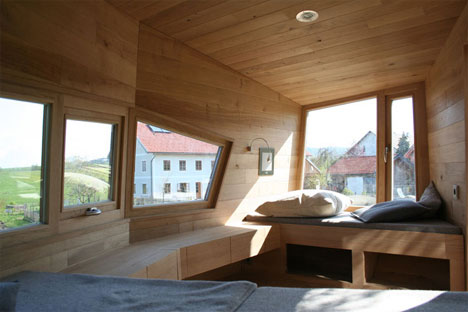
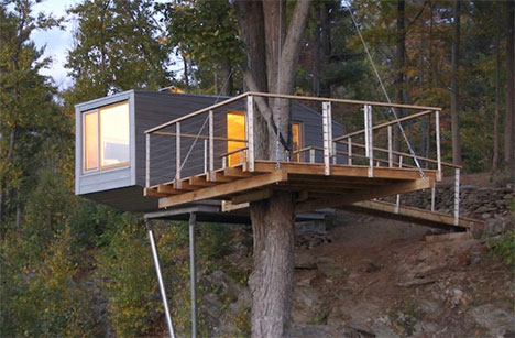
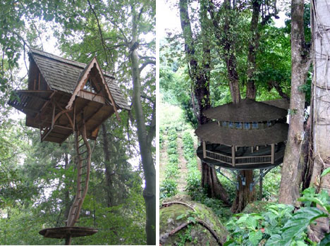
German cooperative baumraum offers fully customizable tree houses made primarily of wood and rope, with clean, modern lines that defy the traditional assumptions about what tree houses should look like. The tree houses above were commissioned by clients in Austria and New York, respectively, and were built to suit the individual sites with the intent of disturbing the surroundings as little as possible.

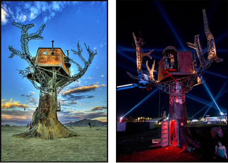
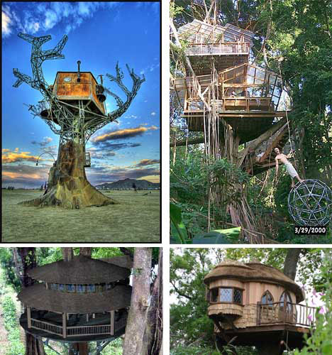
The interactive Steampunk Tree House is a movable work of art created by over 60 San Francisco area artists, crafted in part from recycled and reclaimed materials. It has traveled to the Stagecoach and Coachella music festivals and has been featured on BoingBoing TV. The 30′tall, 8-ton tree was “made to explore the relationship between our rapidly changing natural world and the persistent human drive to connect with it and one another.”

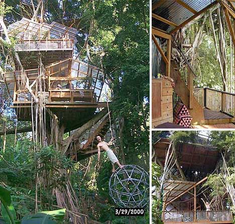
The Biosphere Tree house is situated in a great Indian banyan in the Manoa Valley of Oahu. This seven-level tree house has transparent roofs, electricity, a composting toilet, hanging bridge and stunning views of the valley and the sea beyond Waikiki. A 7-foot steel “star dome” swings above a pool in the stream at the foot of the tree.

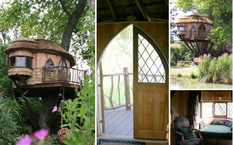
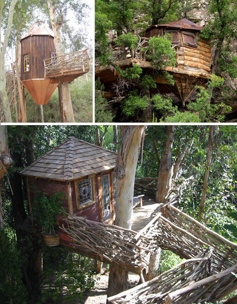
The three tree houses above were created by Blueforest, a UK-based company offering full design, consultancy and management services for tree house projects across Europe. Blueforest’s adult-size tree houses start at around $15,000 and many have kitchenettes, bathrooms and full-sized living rooms. Some even include high-tech features like fingerprint locks, CCTV control centers and plasma televisions.

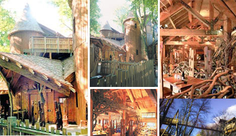
The Alnwick Garden tree house is one of the largest wooden tree houses in the world at 6,000 square feet. Inside is a learning center, restaurant complete with fireplace, play areas, turrets and rope bridges. The tree house was built using natural materials from sustainable resources including Canadian cedar, Scandinavian Redwood and Scots pine. The Alnwick garden is a public garden space in Northumberland, England.

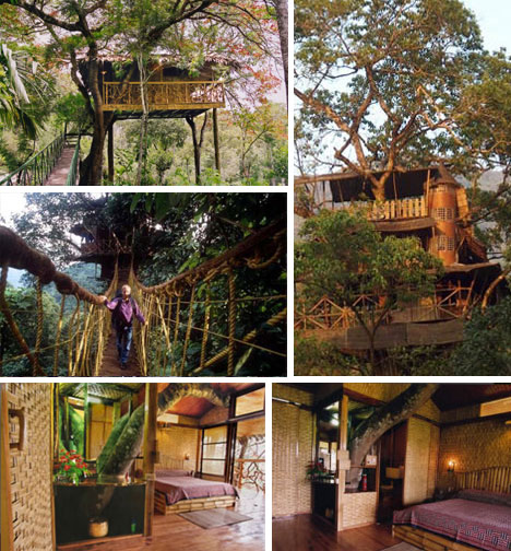
These two relaxed yet highly functional tree houses are part of the Finca Bella Vista tree house community in the rainforest of Costa Rica. The community is home to ecologically minded adventurers wishing to preserve the 300 acres of rainforest surrounding their homes. Its residents enjoy hydroelectric and solar power and wi-fi internet, and have biodigestors to process waste. Dozens of land parcels are still available for future residents to design and build their own tree houses.

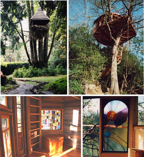
Romero Studios, helmed by Roderick and Anisa Romero, designs and creates tree houses so striking they look more like art installations than dwellings. Their work includes one of the tree houses at Finca Bella Vista and the four tree houses pictured above, among many others. Clients have the freedom to create the tree house of their dreams, from Moroccan lantern-shapes and suspended ‘nests’ to rustic cabins in the sky. Special touches include built-in storage and stained glass windows.